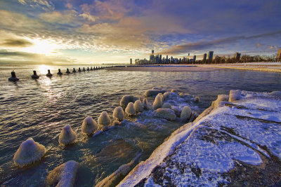
emmelafoto
I must thank all who have entered. I've greatly enjoyed looking at all the entries, thinking about them, and, although it's not been easy, deciding which images are deserving of first, second, and third prizes, and honourable mentions.
I am please to announce that the winner is:
emmelafoto

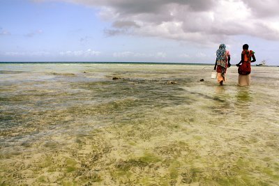
The lower half of this image is almost an abstract, formed from the shapes and textures of the beach. It's joined, by the single post, to the populated section. The figure on the left keeps moving the point of view back into the crowd. The two on the right hold the figures together. The strip of sky at the top, although featureless, balances the busyness immediately below it. The tones are soft, warm and well controlled. It's almost a high key image. I like it a lot. I don't think I would have seen it myself, had I been there.
Maaike - congratulations!
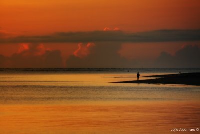
Second place goes to:
terrybowker
This hit me the moment I saw it. Well composed, and fantastic lighting and colours. I greatly enjoyed the perspective produced by the distant city. A novel yet traditional and accomplished landscape and seascape.
Well done Terry!
I award third place to:
jojie_alcantara
Jopjie; This is my favourite of your three excellent entries. Lovely colours and textures, and a simple composition. Great cloud shapes. The horizon is central – which breaks one of the 'rules' – and I think that works well. Congratulations!
I must also award these honourable mentions (with full bragging rights), in no particular order, to:
dingo

This is not an obvious interpretation of the theme, yet it is a very good one. I like the composition, and the selective depth of field. The colours tone well too. Very good Dima&Nelya.
nickviv
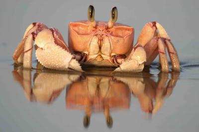
Nick: Lovely soft colours on this crab. Sharp eyes – that's important – and good use of depth of field. The low angle and head on view makes it an interesting composition, and the uncluttered surround, and complete reflection finish it. Excellent photo!
amoxtli
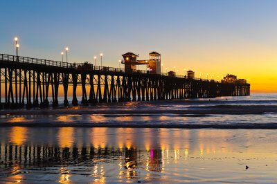
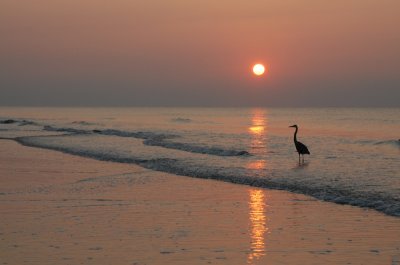
Walter: I congratulate you for timing the photograph so perfectly; you got that time of day when the lights on the pier and the fading daylight are balanced. Great reflections in the sand. Fantastic photograph!
christophertravels
Chris: I thought your three worked well together as a set, and I found that particularly pleasing. I thought this, the middle image was the strongest of the three. I enjoyed the colours, the sea and sky contrast nicely. The composition is interesting; a good use of the rule of thirds, for both the figures and the horizon. Very interesting; well done Chris!
bartoszkotulski
Bartosz: Three great images! I should like to award an 'Honourable Mention' to your third. The colours are wonderful. I do like the composition and the texture of the wet sand. Exposure must have been tricky, but you've got it spot on. Excellent!
fishit
Dennis: I'm glad I saw this full size; the smaller version does not do justice to the subtle colours of the original. The composition also works better on the full size version. I hope other viewers will click on the image to see it full size. Nice, simple composition, with subtle colours that deserve an 'Honourable Mention'.
grompem
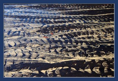
Markus: I do like the abstract patterns in this, and the gold and deep blue colours go so well together. The reflections at top left do help the composition, and the orange elements in the centre – whatever they are – complete it. Very well done!
mdejong
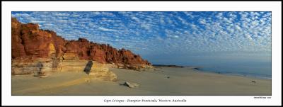
Marcel: Three very accomplished images. My favourite of the three is probably the middle (Cape Leveque 1), because of the texture in the sky, the combination of colours, and the soft lighting that just brings out the textures in the rock. The panoramic format works well too. But any of them could have won this honourable mention; congratulations!
sandiwhi
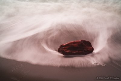
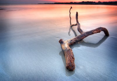
I love the tones of this, the texture of the water (great use of slow exposure), the shape and almost glowing tones of the wood. I hope you've a print of this on your wall!
Maaike: You now have the privilege and responsibility of being the duly appointed curator and judge of the 207th Show and Tell Competition. The choice of subject is yours. I hope you enjoy the task as much as I've enjoyed this.
I am please to announce that the winner is:
emmelafoto
The lower half of this image is almost an abstract, formed from the shapes and textures of the beach. It's joined, by the single post, to the populated section. The figure on the left keeps moving the point of view back into the crowd. The two on the right hold the figures together. The strip of sky at the top, although featureless, balances the busyness immediately below it. The tones are soft, warm and well controlled. It's almost a high key image. I like it a lot. I don't think I would have seen it myself, had I been there.
Maaike - congratulations!
Second place goes to:
terrybowker
This hit me the moment I saw it. Well composed, and fantastic lighting and colours. I greatly enjoyed the perspective produced by the distant city. A novel yet traditional and accomplished landscape and seascape.
Well done Terry!
I award third place to:
jojie_alcantara
Jopjie; This is my favourite of your three excellent entries. Lovely colours and textures, and a simple composition. Great cloud shapes. The horizon is central – which breaks one of the 'rules' – and I think that works well. Congratulations!
I must also award these honourable mentions (with full bragging rights), in no particular order, to:
dingo
This is not an obvious interpretation of the theme, yet it is a very good one. I like the composition, and the selective depth of field. The colours tone well too. Very good Dima&Nelya.
nickviv
Nick: Lovely soft colours on this crab. Sharp eyes – that's important – and good use of depth of field. The low angle and head on view makes it an interesting composition, and the uncluttered surround, and complete reflection finish it. Excellent photo!
amoxtli
Walter: I congratulate you for timing the photograph so perfectly; you got that time of day when the lights on the pier and the fading daylight are balanced. Great reflections in the sand. Fantastic photograph!
christophertravels
Chris: I thought your three worked well together as a set, and I found that particularly pleasing. I thought this, the middle image was the strongest of the three. I enjoyed the colours, the sea and sky contrast nicely. The composition is interesting; a good use of the rule of thirds, for both the figures and the horizon. Very interesting; well done Chris!
bartoszkotulski
Bartosz: Three great images! I should like to award an 'Honourable Mention' to your third. The colours are wonderful. I do like the composition and the texture of the wet sand. Exposure must have been tricky, but you've got it spot on. Excellent!
fishit
Dennis: I'm glad I saw this full size; the smaller version does not do justice to the subtle colours of the original. The composition also works better on the full size version. I hope other viewers will click on the image to see it full size. Nice, simple composition, with subtle colours that deserve an 'Honourable Mention'.
grompem
Markus: I do like the abstract patterns in this, and the gold and deep blue colours go so well together. The reflections at top left do help the composition, and the orange elements in the centre – whatever they are – complete it. Very well done!
mdejong
Marcel: Three very accomplished images. My favourite of the three is probably the middle (Cape Leveque 1), because of the texture in the sky, the combination of colours, and the soft lighting that just brings out the textures in the rock. The panoramic format works well too. But any of them could have won this honourable mention; congratulations!
sandiwhi
I love the tones of this, the texture of the water (great use of slow exposure), the shape and almost glowing tones of the wood. I hope you've a print of this on your wall!
Maaike: You now have the privilege and responsibility of being the duly appointed curator and judge of the 207th Show and Tell Competition. The choice of subject is yours. I hope you enjoy the task as much as I've enjoyed this.