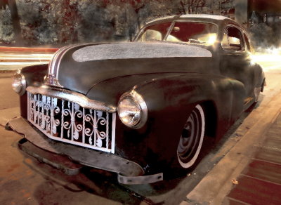
http://www.pbase.com/billinchapelhill/image/79687141
For comparison here is the pre processed version
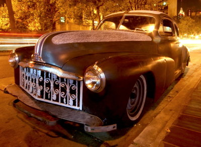
http://www.pbase.com/billinchapelhill/image/79814471
Board index ‹ Photography ‹ Artistic Questions ‹ Too much post processing?
![]() Sat Jun 02, 2007 1:48 pm
Sat Jun 02, 2007 1:48 pm
![]() Sat Jun 02, 2007 4:51 pm
Sat Jun 02, 2007 4:51 pm
![]() Sat Jun 02, 2007 7:03 pm
Sat Jun 02, 2007 7:03 pm
![]() Sat Jun 02, 2007 8:01 pm
Sat Jun 02, 2007 8:01 pm
![]() Sun Jun 03, 2007 9:23 am
Sun Jun 03, 2007 9:23 am
![]() Sun Jun 03, 2007 10:15 pm
Sun Jun 03, 2007 10:15 pm
![]() Mon Jun 04, 2007 12:57 am
Mon Jun 04, 2007 12:57 am
![]() Thu Jun 07, 2007 11:39 pm
Thu Jun 07, 2007 11:39 pm
![]() Wed Jun 20, 2007 11:50 pm
Wed Jun 20, 2007 11:50 pm
![]() Thu Jun 21, 2007 1:27 am
Thu Jun 21, 2007 1:27 am
![]() Thu Jun 21, 2007 9:12 am
Thu Jun 21, 2007 9:12 am
![]() Fri Jun 22, 2007 3:30 am
Fri Jun 22, 2007 3:30 am
billinchapelhill wrote:This shot is a big favorite of mine right now and I thought it would be quite popular but not so far. Due to the long night time exposure under heavy yeloow street lighting, the original was heavily monochrome and dominated by dull yellows. So I did much more color correction and painting than is my norm. The result is that the PP is much more obvious and I ask you if you feel that it is too much.
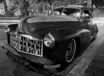
billinchapelhill wrote:Per the last 2 posts, here it is in mono with minimal pp work. For sure this is a pretty simple way of dealing with the exposure and sodium lighting issues, and presented this way it does not turn off the viewer that has those kind of viewing pre-requisites.
I like it quite well in mono but it brings the image closer to normal and for me sacrifices the uniqueness of the bizarre lighting coloring. If I was more patient and skilled at touch up, I think the colored verzion would grab more of those so disposed.
![]() Fri Jun 22, 2007 9:30 pm
Fri Jun 22, 2007 9:30 pm
![]() Fri Jun 22, 2007 9:58 pm
Fri Jun 22, 2007 9:58 pm
billinchapelhill wrote:Andrys
No I am not offended because what you did was in context with my post and the thread content. I have done the same in the past after getting permission first from the photographer. So I suggest that etiiquette to you and others as well.
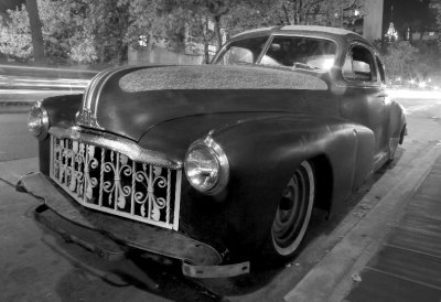
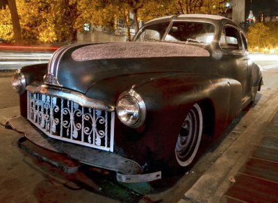
In your temp gallery, the first images hold together the best for me but the latter ones all are increasingly problematic because of the increasing noise (not sure if this is the right term) in the left front fender. The last image has the most thumbnail appeal and the most fender noise.
My knowledge of PP tools is quite lacking. I have no idea what LAB mode and Lightness are. I still use the free MGI PhotoSuite IV tool that I got years ago as my high end PP'er. Someday I will upgrade.
My comment about not being "quite popular" is relative to the popular photos page where this image did not take off as I thought it might at the time.
Thanks to all for commenting and I hope to see more collaborative threads coming to life in this forum.
Board index ‹ Photography ‹ Artistic Questions ‹ Too much post processing?
Users browsing this forum: ClaudeBot and 1 guest