********************************************************************************************************************************************************
First let me start with the runners up in no particular order
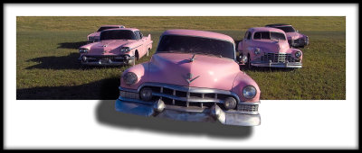
Marcel - PEPTO BISMOL ON WHEELS impressed me a lot - a wonderful find and definitely a very unique approach to making an image out of it
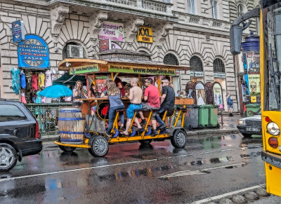
John - Beer Bike, Budapest was a very nice example of using a filter technique that looks great with the subject. The main critique I would make on this would be to crop in a little more to eliminate the part of the bus and the car on the right.
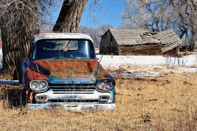
luxun54, this is a great scene and composition. The one critique I have on this would have been to darken the grass a little bit so it was not quite so bright. Probably just in the posted version, because I imagine this would print pretty nicely.
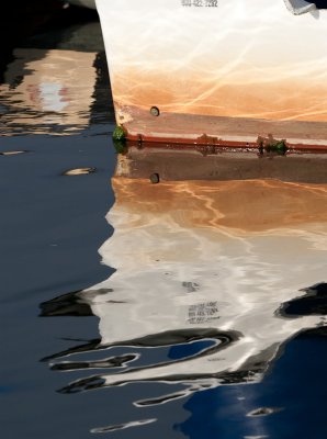
Ken - this and your other boat abstracts are all excellent. I think I would have tried to crop this on so that the thing in the top right corner was not there -it distracted me a little
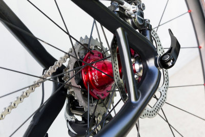
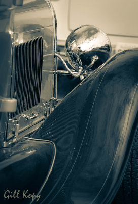
Marcus - this is a wonderfully conceived abstract/detail shot. I think the only thing I did not like is that the bike frame was a little out of focus and I would have liked to have seen that more perfectly sharp.
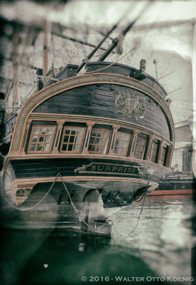
Walter - I really like the overall aged, texture overlaid, ethereal look of this. I think if thus were mine, I would have used a darker texture, vignette, grad ND or something to darken that white band across the top or maybe crop below it.
********************************************************************************************************************************************************
I had a very hard time deciding on second or third since these all could have very nearly been 1st - so here is a 3 way tie for 2nd.
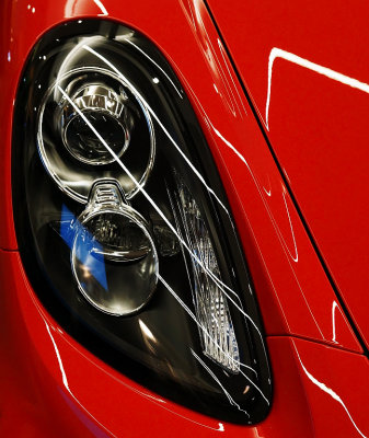
2nd Place tie Aldeca - this is graphic excellence in my opinion. A great composition, stunning color and sharpness. The lines of the reflections combined with the shapes in the headlight are very attractive. The only thing I would change on this would be to edit it so the blue area is black - using the tools for that in whatever editing software you use.
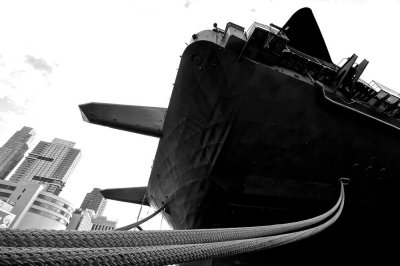
2nd Place tie Szczepan; I loved this one due to the incredibly different and compelling POV that is especially effective in B&W. The one thing I didn't think was optimal, and I know how hard this is to do sometimes, was the almost totally white, empty sky. This might have worked well as a bracketed HDR image.
2nd Place tie Al - beautiful, well targeted composition that looks wonderful in this toned monochrome processing. The only thing I would have changed would be to edit out the black outline of the door on the car in front of this.
********************************************************************************************************************************************************
Winner
********************************************************************************************************************************************************
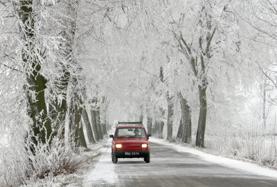
1st Place - Pawel, you did and amazing job with this. The clean, practically monochrome scene with the bright red little car - all of it perfectly exposed in a nicely balanced composition is so compelling. Congratulations!!
Great submissions from everyone - I enjoyed them a lot. Thanks for your patience - it is harder running a contest - especially the judging, since there are so many excellent images.
Anyway -Pawel it is now in your hands.